
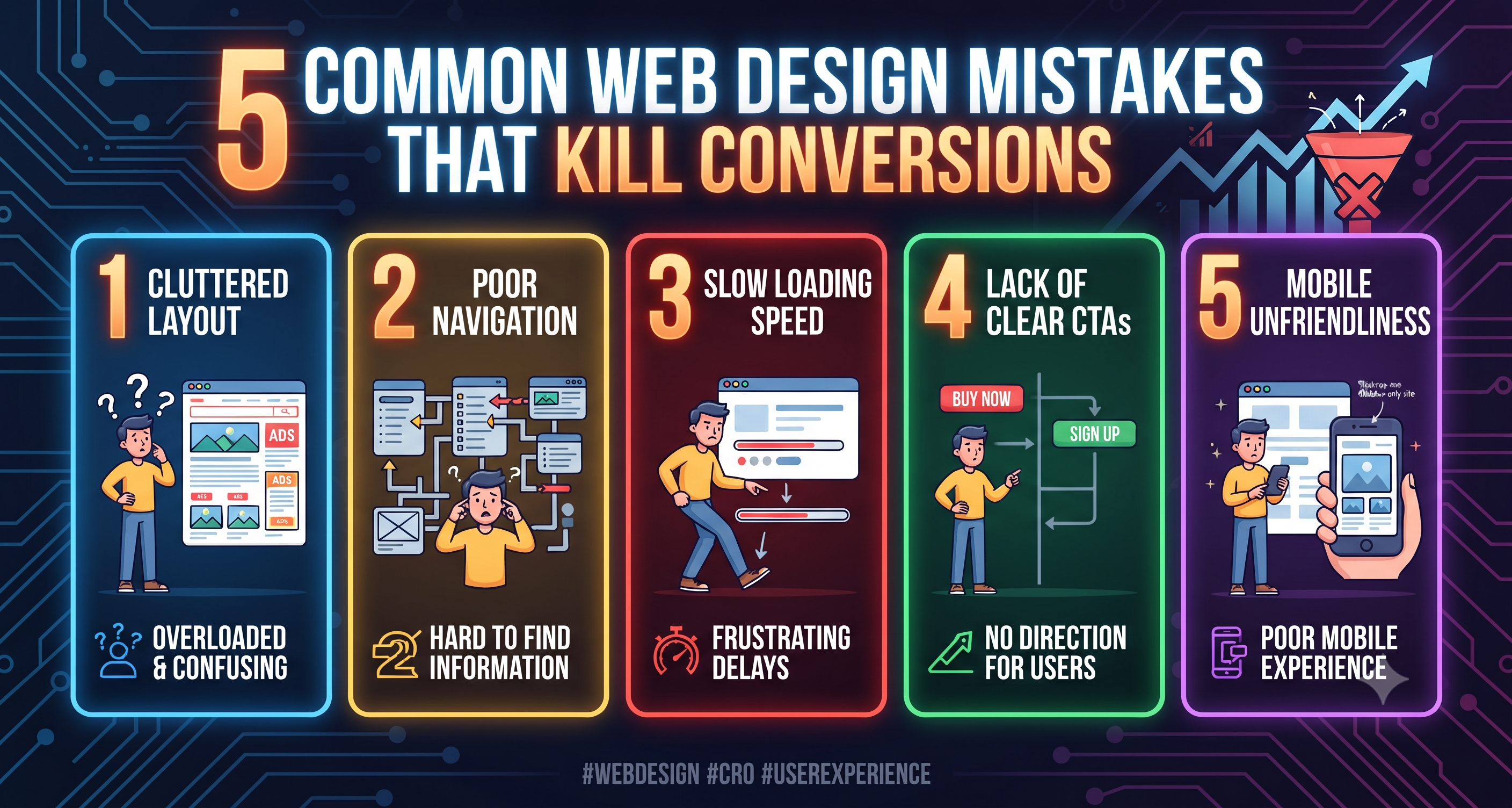
You have invested weeks in crafting a stunning website, filled it with compelling copy, and driven a steady stream of traffic through ads and social media. Yet, when you check your analytics dashboard, the story is grim: high bounce rates, filled-cart abandonments, and conversion rates hovering near zero.
What went wrong?
Often, the bottleneck isn't your product, your pricing, or your marketing strategy. It is your web design. Even minor friction points, visual clutter, or poor navigation structures can quietly sabotage user intent and bleed revenue.
Let's examine five common web design mistakes that kill conversions and how you can fix them to turn casual visitors into loyal customers.
1. Cluttered Layouts and Cognitive Overload
When a user lands on your website, they should immediately understand who you are, what you offer, and what they need to do next. Unfortunately, many sites overwhelm visitors with a chaotic avalanche of flashing banners, dense paragraphs of text, competing call-to-action (CTA) buttons, and irrelevant stock imagery.
The Conversion Killer:Cognitive overload. Human attention spans are short, and working memory is limited. When a user has to work too hard just to figure out what your business does, they won't stick around to solve the puzzle—they will simply close the tab and head to a competitor.
The Fix: Embrace whitespace (negative space). Strip away decorative elements that do not serve a clear purpose. Establish a clear visual hierarchy using typography and layout scaling so the user’s eyes are guided effortlessly from your value proposition directly to your primary conversion goal.
2. A Weak, Buried, or Confusing Call-to-Action (CTA)
Your CTA is the ultimate destination of your conversion funnel. Whether it is "Start Your Free Trial,""Download the Ebook," or "Buy Now," your CTA button represents the bridge between a browser and a customer. Yet, surprisingly many websites hide this crucial element below the fold, use vague wording, or blend it completely into the background.
The Conversion Killer: If a user has to hunt across your page just to find out how to buy from you or sign up, you have already lost them. Buttons labeled simply "Click Here" or "Submit" also fail to communicate value.
The Fix: Make your primary CTA unmissable. Use high-contrast colors that pop against your color palette. Place your main CTA above the fold on key landing pages, and repeat it naturally at strategic points down the scroll. Crucially, use action-oriented, value-driven copy (e.g., "Get My Instant Audit" instead of "Submit").
3. Slow Page Load Speeds and Performance Lag
In the digital world, patience is virtually non-existent. Studies consistently show that as page load time increases from one second to three seconds, bounce rates skyrocket. If your website takes too long to render, visitors will leave before they even see your headline.
The Conversion Killer: Unoptimized high-resolution images, bloated third-party scripts, uncompressed code, and cheap hosting infrastructure create a sluggish user experience. If your site feels heavy on desktop, it will likely crawl on mobile devices.
The Fix: Prioritize web performance optimization from day one. Compress images using next-gen formats (like WebP), leverage browser caching, minify CSS and JavaScript files, and invest in reliable cloud hosting or a Content Delivery Network (CDN). Every millisecond you shave off your load time directly translates into higher conversion rates.
4. Neglecting Mobile Responsiveness and Touch Friction
With the majority of web traffic originating from smartphones and tablets, mobile optimization is no longer optional. Yet, many sites are still built with a "desktop-first" mindset, resulting in broken layouts, tiny unclickable text links, and frustrating horizontal scrolling on mobile devices.
The Conversion Killer: If your checkout form is a nightmare to fill out on an iPhone, or if your navigation menu disappears on smaller screens, potential customers will abandon their carts out of pure frustration.
The Fix: Adopt a mobile-first design philosophy. Ensure typography scales smoothly, form fields are large and easy to tap with a thumb, and hamburger menus are intuitive. Test your checkout and sign-up flows rigorously across actual mobile devices to ensure a frictionless experience.
5. Friction-Heavy Forms and Invasive Lead Capture
Forms are the gateways to lead generation and sales, but they are also notorious conversion killers. Asking too many questions too soon, demanding unnecessary personal information, or burying users in complex multi-step fields creates immediate friction.
The Conversion Killer: Asking for a user's phone number, home address, company size, and birthday just to download a simple whitepaper feels like an invasive interrogation rather than an exchange of value.
The Fix: Minimize form fields to only what is absolutely necessary. If you only need an email address to send a newsletter or resource, don't ask for anything else. For complex onboarding flows, utilize a progress bar and break fields down into manageable, multi-step stages so the process feels effortless.
Conclusion
Fixing a low conversion rate doesn't always require a massive marketing budget or a total rebrand. Often, it requires looking at your website through the objective eyes of your user.
By eliminating visual clutter, sharpening your CTAs, optimizing page speed, perfecting mobile responsiveness, and simplifying your forms, you remove the hidden friction points that drive customers away. Audit your website today, smooth out the user journey, and watch your conversions climb.